Introduction to Data Analysis Lesson 4 Data Analysis Process - Case Study 1: Matplotlib Example


Matplotlib Example
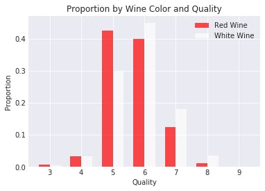
Below is the Type and Quality Plot created with Matplotlib. As you can see, Matplotlib gives us much more control over our visualizations.
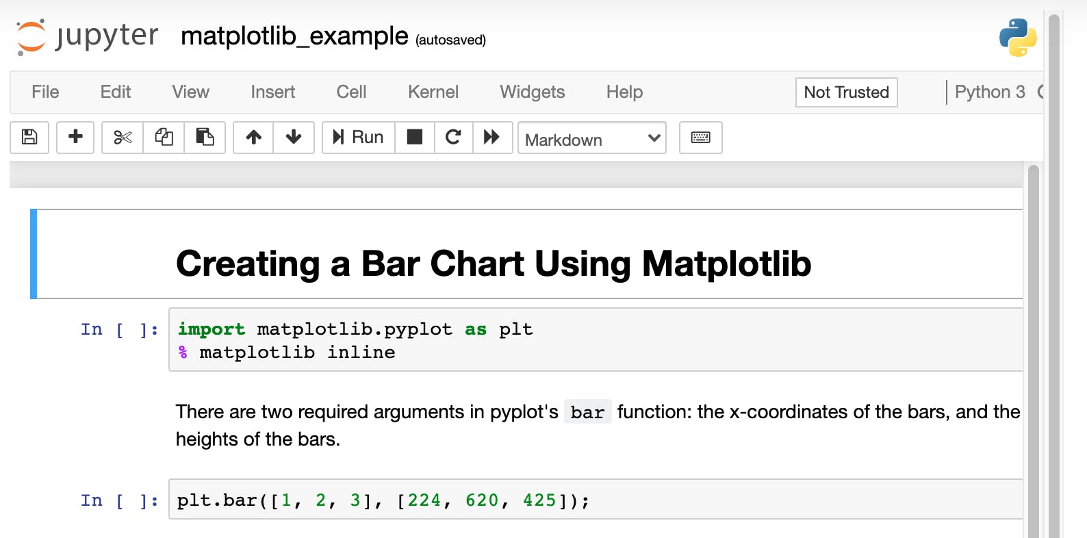
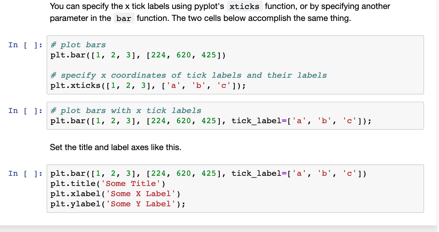
Before we jump into the making of this plot, let's walk through a simple example using Matplotlib to create a bar chart. We can use pyplot's bar function for this.