Introduction to Data Analysis Lesson 4 Data Analysis Process - Case Study 1: Type & Quality Plot with Matplotlib


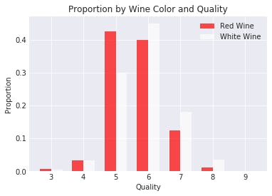
Type & Quality Plot with Matplotlib
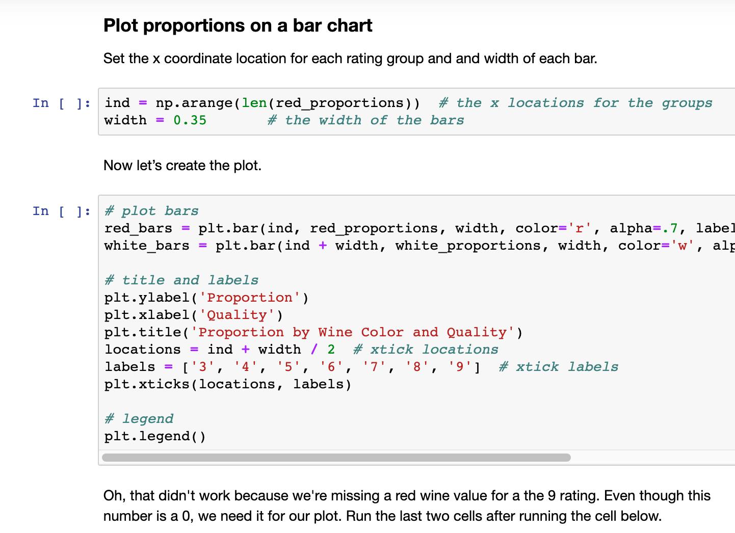
Below is the code used to create this plot with Matplotlib. (Please note the code requires you to have created and saved the 'winequality_edited.csv' file in a coding exercise earlier in this lesson.)
# plot bars
red_bars = plt.bar(ind, red_proportions, width, color='r', alpha=.7, label='Red Wine')
white_bars = plt.bar(ind + width, white_proportions, width, color='w', alpha=.7, label='White Wine')